Invest in the Future You Want to See.
A First Public Offering of Purism Stock on StartEngine. Minimum $500.
Designing the Mobile Experience with Convergence in Mind

François Téchené
Latest posts by François Téchené (see all)
- Replacing the Screen of Your Librem 5 - January 25, 2024
- Working with the Librem 14 - November 22, 2023
- Introducing the Liberty Phone - June 30, 2023
It is always great to have the opportunity to discuss face to face with community members to get the pulse of what their thoughts are and suggestions they might have for the Librem 5 project. As such, I was happy to spend time discussing at length with people attending FOSDEM this week-end. Comments from the many supporters made me realize that there are some points regarding goals and vision, in terms of design for the entire Librem line, that needed to be expanded upon and clarified. Keep in mind that although the vision for our short and long-term design goals for the Librem 5 is becoming increasingly clearer, it is of course still “work in progress” from a design perspective; things are not set in stone and therefore we are listening (and responding) to the community’s feedback.
Convergence, for Purism, is a long-term goal to unify the human experience across different devices.
- A user interface is made of a layout and interactive elements. Different devices using different input and output technologies will have different requirements for layout and interaction. In this case, our approach will consist in designing “responsive” (adaptative) layouts and interaction patterns that will allow modern apps to adapt themselves to the device that it is running on. We don’t have to port/adapt every single existing desktop app under the sun to achieve that goal though, and our partners in the GNU+Linux community have aligned goals with this direction.
- That approach of convergence is also about the simplicity of accessing the same data and services between different devices, transparently.
- Part of our plan for convergence is about helping define some consistent Human Interface Guidelines and optimizing the development tools & documentation, in order to help developers create a great experience across devices.
The implementation of our design involves the use of existing technologies, and the UI+UX design itself is not made with a specific technology in mind. Our design work is an attempt to define a set of Human Interface Guidelines that rely on the Ethical Design manifesto and our requirements for security and privacy. The technical details of its implementation are out of the scope of this design report and should be discussed with the development team.
Designing a Mobile Experience
Over the last two weeks, we have been thinking about general human interaction principles for the Librem 5. Our idea is to define the best possible mobile interaction design principles and combine it with an “optimal” mobile shell experience. While what you will see below is simply a high-level overview of work in progress that may change before final public versions, it is setting the stage, and is a good starting point for our upcoming work, such as the communications features that I’ll soon write about in a separate blog post.
Some Basic Principles
We think that a good mobile experience should define convenience and comfort when using the device. It should take into account the hardware in all its aspects along with the many different use cases. In that regard, it is important to define principles that are adapted to the physical device. One of these principles is that one-handed usage of a phone is frequent, and so our interaction design should take this fact into account.
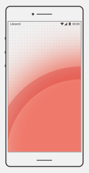
One should be able to easily access the most important features of the phone when holding it with one hand; it supposes touching the screen with the thumb only. That doesn’t necessarily mean that all the screen surface and features must be accessible by the thumb (given the planned 5.5″ screen size, that would not be physically possible), but that the lower area is preferable to access the most useful phone features by default. Those features would include answering an audio or video call, reviewing notifications, unlocking the phone, accessing the home screen, requesting a search or launching the most frequently used applications.
To remain useful for both right and left-handed persons, the optimal area should favor the bottom half of the screen while also avoiding going too far towards the edges (that may be more difficult to access).
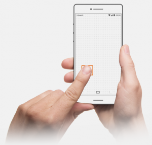
The size of the touch (tap) area is also something to take into account in order to give the user the best precision when interacting with the user interface.
Action targets like links, buttons, sliders and other interactive UI elements should take into consideration a sufficient surface size to be used with comfort and precision.
A First Look at the Shell
Peter K., our lead UI/UX designer, has been working on adapting these basic principles to the overall UI shell experience :
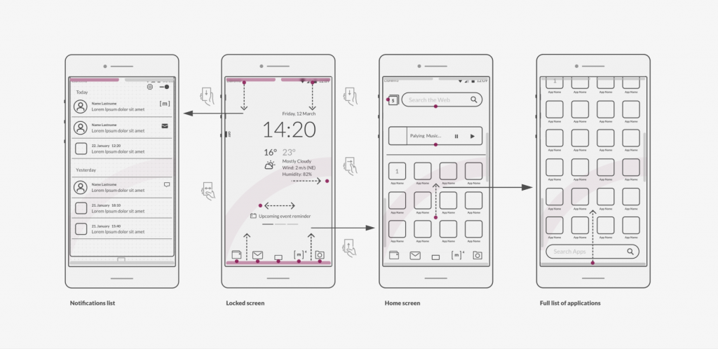
The main navigation happens at the bottom half of the screen, and similarly the majority of the interaction with the Lock Screen would happen in the lower half of the screen. When unlocked, the phone would reveal the Home Screen and show the most frequently used applications (or features) of the phone by default. Some useful widgets may use the remaining space (our example is showing music controls and web search widgets). Swiping up the frequently used applications icons reveals the full list of applications as well as the “main” search field, that is also accessible at the bottom of the screen. Less recurrent gestures, like accessing the settings or the detailed list of notifications, are available in the upper part of the screen.
More to Come
This was a quick appetizer regarding the ongoing design effort. Upcoming work will be about finalizing the shell experience and designing privacy-respecting communication features, so stay tuned!
Recent Posts
Related Content
- Missing from Privacy Legislation- The Abolishment of Surveillance Capitalism (Predatory & Harmful Surveillance Business Practices)!
- Introducing the Liberty Phone
- Purism Liberty Phone with Made In The USA Electronics
- Introducing the Librem Server v2
- Librem 5 USA Smartphone Provides Many Exclusive Security Features