
Librem 5 App Design Tutorial – Part II
Purism
Latest posts by Purism (see all)
- Purism Announces Launch of Its Librem 16 Laptop, the World’s Most Private and Secure Workstation - June 23, 2026
- Google’s Lock Down Policy - May 21, 2026
- Smartphone Study - May 21, 2026
Hello and welcome to the second of my series of blog posts on how to design your own, brand new app for the Librem 5.
In my last post we went over the philosophy and process, goals and relevant art of building a read-it-later app; today we’ll be covering the basics of navigation, layout, and adaptive design, for both mobile and desktop.
Sketches and Mockups
Now that we have a pretty clear idea of the structure of our app, we can finally dive into designing the UI. Personally, I like starting off with sketches on paper and only then move to Inkscape for more detailed mockups, but you may use any tool you’re familiar with. There’s no need to be good at drawing, or good at a particular application, for this; you should just find a way to visualize your ideas – any way that works for you is good.
If you are using Inkscape for mockups, you might want to check out the GNOME mockup template for some common layouts and patterns to use in your designs. If you are looking for GNOME-style symbolic icons for your mockups, you can find them here, here, and here.
Navigation
When it comes to the layout of an interface, it’s a good thing to have in mind what navigation structure would make the most sense for the type of content you have. The most common navigation patterns for GNOME apps are the Stack, the View Switcher and the Sidebar List.
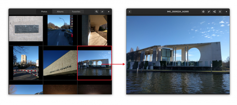
The Stack pattern is meant for when the views are completely separate, the UI is not shared and there is a back button that enables you to go back to the overview. This is, for example, how Photos allows you to navigate between a stream of photos and the detailed view of an individual photo. This means there is a bit more friction to switch between views than with other patterns – but it’s also more focused. It’s a great pattern when you don’t have to switch between views a lot.
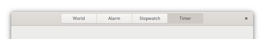
The View Switcher is better for cases in which a small number of views are either equally important or need to be easily accessible. It’s used in GNOME apps such as Clocks, Music and Software as the primary form of navigation. On the desktop this switcher is always in the header bar, but a new adaptive version of it, which moves to the bottom of the screen for mobile, is being developed. It’s not quite ready yet, but it will soon hit a version of Libhandy near you.
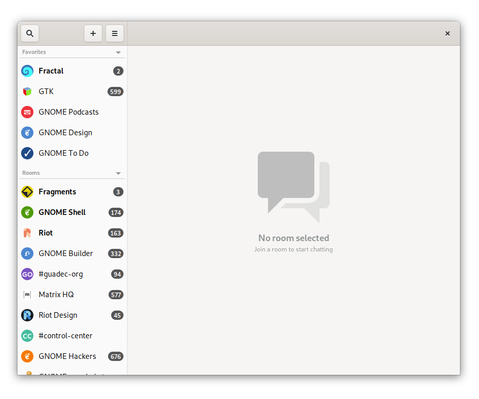
The Sidebar List is used when not only you have a lot of views, but you also often need to switch between them. It’s used in Fractal’s room list for example, because it gives a quick overview of all rooms and allows for quick context switching. On mobile, where there’s obviously not enough space for a content pane and a sidebar, you can use a Libhandy widget called Leaflet which transforms a Sidebar List on desktop into a Stack on mobile.
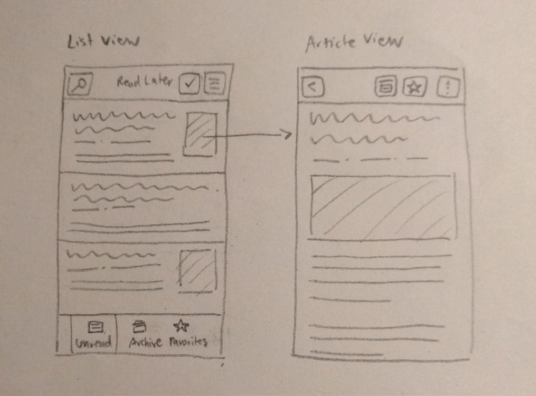
Sidebar List and Stack navigation
For our own read-it-later app, we will need navigation to switch between the different lists (Unread, Archive, Favorites) and between lists and article views.
The former is a small set of views that we want easily accessible, so a view switcher is a good fit. Since we can’t use the shiny new adaptive view switcher widget yet, we can use a plain old view switcher in the header bar (though we can, and should, design the UI with the beautiful new switcher in mind).
For the latter we could either use a stack or a sidebar list (along with the Leaflet widget so it works on mobile). Since we want this app to allow for a focused reading experience, and switching back and forth quickly between articles is not going to happen very often, a Stack is probably the best solution.
This means our main screens will look something like:
Article List Screens
Now that we have a basic navigation structure, we can design each individual screen in more detail. These three article list screens are basically the same lists, but with different content.
The main purpose of these screens is to provide a nice, legible list of saved articles that entices people to catch up with their reading (list). In order to do this we’re going to go for a comfortable layout – which should include the article’s title, a preview, and some information about each article.
To help users catch up with their saved articles we should also try to make the content as interesting as possible. A plain, reverse-chronological list of saved items can be quite boring, and I’ve noticed I myself often scroll down the list randomly, looking for older articles. A potential way to build this feature into the core experience would be to show the reading list in a randomized order, while also showing the most recently saved articles at the top, as a separate category (see the mockups below).
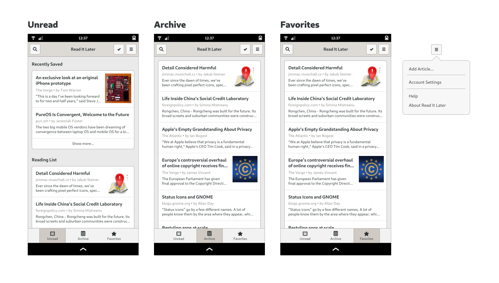
In terms of actions, we need to expose Search and Selection modes (for operations on multiple elements) as well as the application’s primary menu. The primary menu contains global app-level categories such as Help, Preferences, and About.
In the selection mode we need to have the ability to move articles to Favorites and Archive and delete them from our reading list. Since this is not an essential functionality though, we won’t be doing designs for it yet (but if you want to learn more, have a look at the selection mode page in the GNOME HIG – and the same goes for search, in the relevant HIG page).
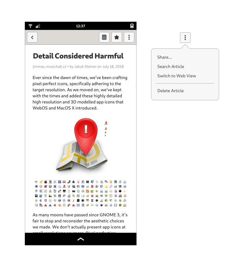
Article Screen
An article screen’s job is pretty straightforward: it’s meant to provide a great reading experience for the saved articles. Since many websites kind of suck in this regard, a reader mode (like the ones Epiphany and Firefox have) should be the default view whenever possible. There is however no guarantee that a given article will end up perfectly rendered, and we do need a way to show the website in its native styling, if and whenever necessary.
We also need to move articles into Favorites and Archive, and be able to delete and share them. The most important actions are usually shown directly in the header bar; the remaining ones (or simply the result of not having enough space) will call for a secondary menu.
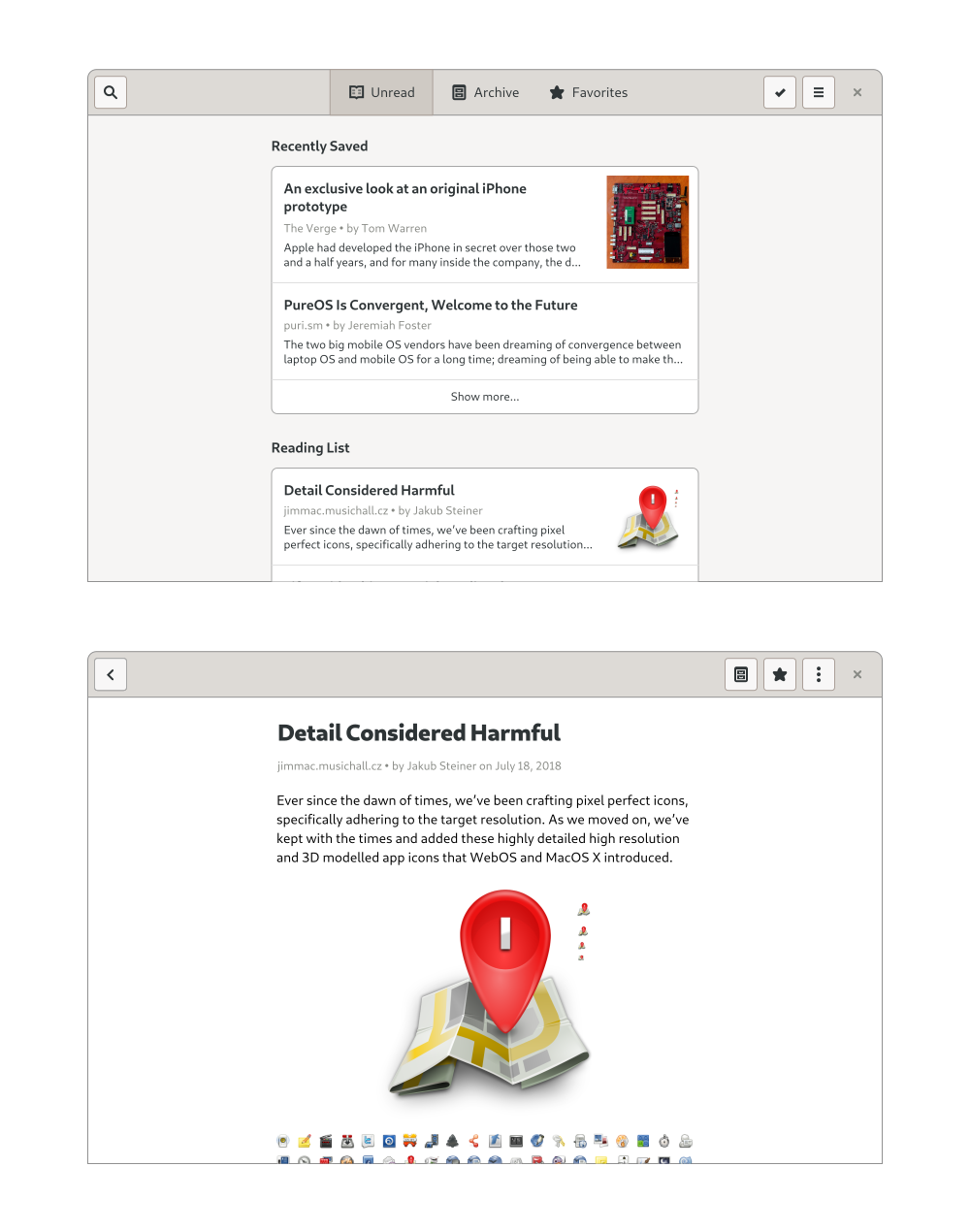
Desktop
We should by now have a more or less clear idea of what our app looks like on mobile; but what will it look like on desktop? Similar to responsive web design, if we design our app for a mobile environment first, it’s usually pretty easy to make it work well on larger screens as well.
As our app has no sidebars or other complicated layout elements, the main change is that the content column width will have to grow with the window until it reaches a maximum width which is comfortable for reading. This can be implemented by wrapping the content area in a HdyColumn. The view switcher will also move up to the header bar, and there will be a close button on the right side.
We now have the basic structure and most important screens for the application – but that’ far from being everything we need. We need to design login and account settings, empty states, first run experience, errors, search and a number of other things that are beyond the scope of the series… It’s worth noting that mockups tend not to be final, that interfaces almost always change during implementation – as you learn more about use cases, underlying technology and other constraints. Ideally, you’ll also do some informal user-testing with real people, in order to get feedback about what you designed.
If you enjoyed the second part of this tutorial, stay tuned: I’ll be back soon with the third (and final) part. In the meantime, feel free to play with the mockups I made for this tutorial.
Discover the Librem 5
Purism believes building the Librem 5 is just one step on the road to launching a digital rights movement, where we—the people—stand up for our digital rights, where we place the control of your data and your family’s data back where it belongs: in your own hands.
Recent Posts
Related Content
- Smartphone Study
- DHS Inspector General Study
- Wired Confirmed iPhone’s Worst-Kept Secret: Closed Systems Fail at Scale
- Privacy Under Siege
- Sim Swap Attacks Surging

