Design report #3: designing the UI Shell, part 2

François Téchené
Latest posts by François Téchené (see all)
- Black Friday - November 29, 2024
- Replacing the Screen of Your Librem 5 - January 25, 2024
- Working with the Librem 14 - November 22, 2023
 Peter has been quite busy thinking about the most ergonomic mobile gestures and came up with a complete UI shell design. While the last design report was describing the design of the lock screen and the home screen, we will discuss here about navigating within the different features of the shell.
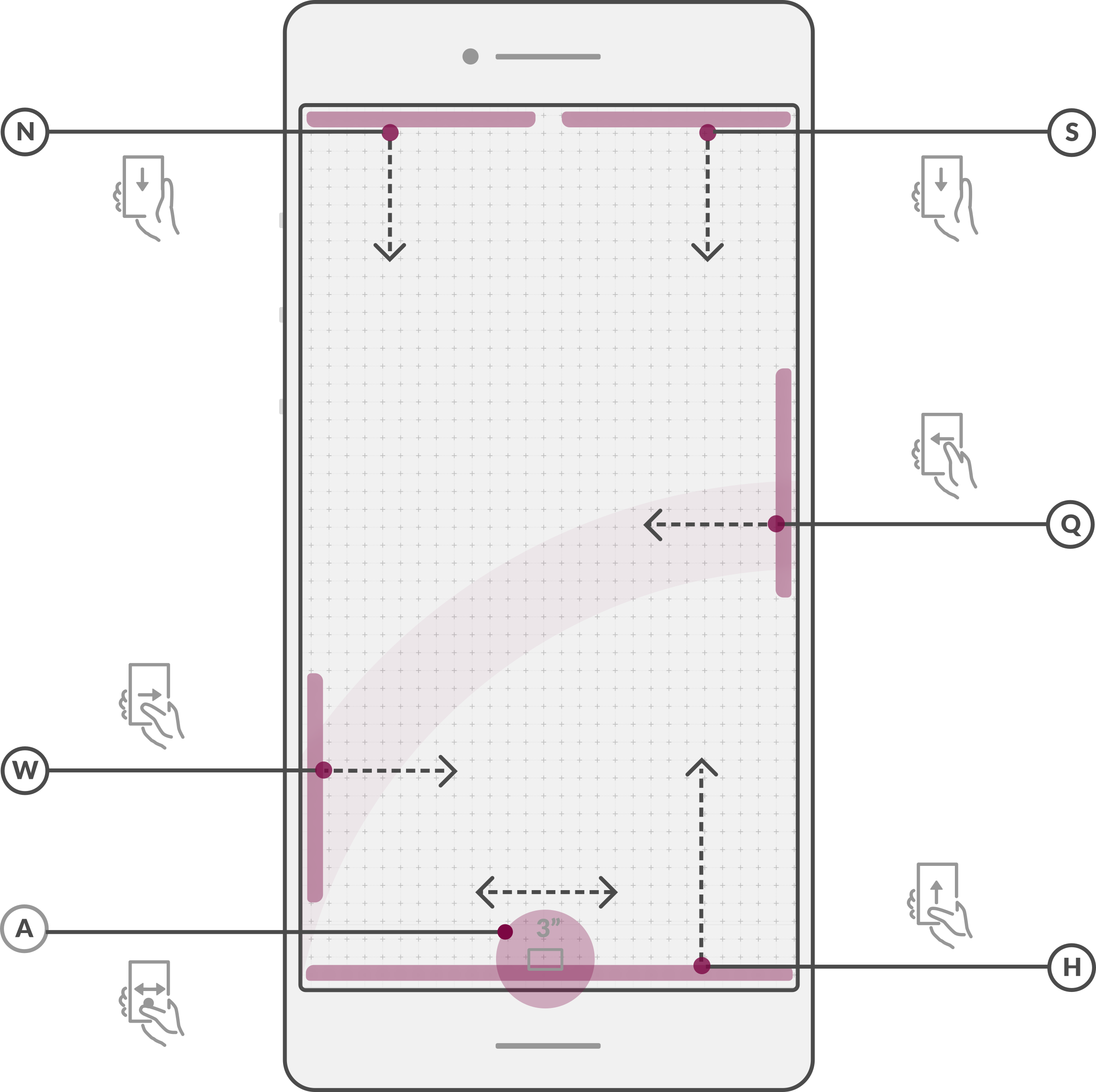
The mock-up on the right describes the main navigation principles. It shows the basic gestures that can be used to navigate through the different features of the shell.
From top to bottom:
- (N) – Pulls down the full list of notifications.
- (S) – Pulls down the full list of system settings.
- (Q) – Reveals the most frequently used settings.
- (W) – Quick launcher (to quickly access the communication features).
- (A) – (3 seconds) Reveals the list of running applications.
- (H) – Navigate back to the home screen.
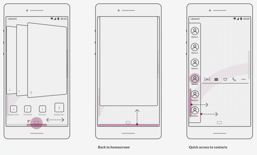
And below are a few more mockups illustrating additional planned features of the Shell:
- The multitasking overview screen that is revealed through the gesture (A) shows a carousel of all running apps along with their icons to make them easier to spot and access in a touch.
- Swiping up from the bottom of the screen, from gesture (H), brings back the home screen
- The “quick launcher” from gesture (W), in this example, is launching a list of (favorite) contacts for a quick access to the communications features.
An experience for people first, not just “app stores”
Now that we have defined the main features and gestures of the shell, it should be time to take care of the applications’ interfaces next.
If the Librem 5 was “Yet Another Android phone,” I would say “Go! Let’s make a bunch of apps!” But the Librem 5 is not just a regular phone, and Purism is very different from Apple and Google in term of philosophy and business model—they have been focusing on having the “biggest” app stores, selling apps, and mining data… and we don’t do that.
Therefore, before hastily moving forward with designing applications interfaces “like the other platforms”, not only must we study the current state of the mobile industry in term of User Experience, we must also try to think on how to improve it with a user-centric paradigm instead of necessarily app-centric. I think that, in some ways, there are many areas where the Librem 5 can bring greater simplicity, making iOS and Android look over-complicated in comparison. It may sound crazy to say that, but bear with me for a moment, we’ll get back to this later on.
By understanding a few concepts, we can try to define some human interface guidelines that will help getting a better user experience by default. This won’t prevent the phone to remain a highly customizable FLOSS platform—it will just help making the Librem 5’s “out of the box” experience more useful for everyone.
Recent Posts
Related Content
- Google Mishandling School Children’s Data
- Ethics over Exploits – Use PureOS over Android/iOS
- Hidden Operating Systems in Chips vs. Secure, Auditable OSes: A Cybersecurity Comparison
- Apple Moves iPhone Production to India—Purism Has Been Leading the Way for Years
- What Is PureOS? A Beginner’s Guide for iOS, Android, and Windows Users