A better-organized website
Purism
Latest posts by Purism (see all)
- A Quarter Century After Cyberselfish, Big Tech Proves Borsook Right - December 20, 2025
- PureOS Crimson Development Report: November 2025 - December 15, 2025
- Purism Liberty Phone Exists vs. Delayed T1 Phone - December 10, 2025

As some of you might have noticed, I have been progressively deploying Purism’s new website over the past few weeks, after some months of small improvements and preparations.
Far from being merely a visual style update, the main goal of this initiative was to reorganize all the contents, to make them easier to find, and more pleasant and interesting to read. Indeed, the existing website had tons of contents, spread everywhere with no clear logic, often buried in obscure parts of the blog that nobody would ever see.
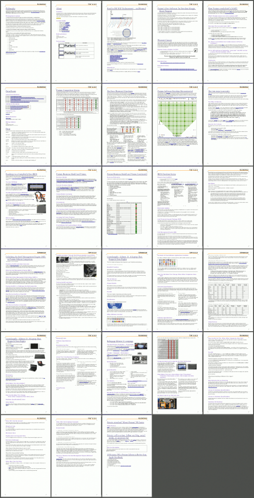
I spent quite a while reading and annotating all the contents of the website, ripping and remixing it into something that makes sense. The screenshot you can see on the right is the summary (without duplicated content) of some of the pages we have reviewed and reworked. And some of the contents are still pending review and improvements.
The new contents organization achieves the following:
- Introduce a clear structure and hierarchy
- Clean up the menus, and spread items across menus in a fully thought-out way
- Clean, human-readable and memorable URLs, based on sections
- Completely rethought blog taxonomy (categories and tags), and exposed posts structure allowing easy browsing based on your fields of interest
- Introduce the “Why Purism?” section to explain our business from two perspectives: our philosophy and our methodology. Add new content to cover the most frequent philosophy and methodology questions we get
- Deduplicating contents
- Reusing contents dynamically (to avoid inconsistencies)
- Turn insightful posts into permanent reference pages to prevent them from being lost and forgotten
- Revise, rewrite, clarify or remove obsolete contents
- Interlinking related pages, particularly in the educational topics of the “Why Purism?” section
- Introduce a ton more imagery, graphics, and visuals to give your eyes a rest amidst the big amount of written contents
- Improved forums notification emails!
A side effect of this: we had to break almost every important hyperlink and URL! However, I put redirects in place everywhere to let you find the contents even if you are accessing them from an old URL.
On top of those content changes, the new visual design I deployed across the website is also fundamentally superior from a typographic standpoint: it made the contents much more legible and readable—not only is it objectively easier to read characters and words all over the place, it is now significantly more pleasant (and thus encouraging) to read anything longer than a few lines. Last but not least, the new design also makes it easier to manage the content layout across pages.
We hope you appreciate these changes as much as we do. Feel free to drop us a line at feedback at wp.puri.sm!
Recent Posts
Related Content
- Purism Liberty Phone Exists vs. Delayed T1 Phone
- Librem PQC Encryptor: Future‑Proofing Against Both SS7 and Quantum
- The NYPD’s $3B “Domain Awareness System” isn’t just a New York problem—it’s a warning for every American
- PureOS Crimson Development Report: July 2025
- Introducing the Librem PQC Comms Server


