Invest in the Future You Want to See. Closing Soon!
A First Public Offering of Purism Stock on StartEngine. Minimum $500.
Librem 5 App Design Tutorial – Part I
Tobias Bernard
Latest posts by Tobias Bernard (see all)
- Design 2022 in Retrospect - February 2, 2023
- Libadwaita in the Wild - December 15, 2022
- Purism at Berlin Mini GUADEC - August 8, 2022
Are you excited about the Librem 5 and GNOME going mobile, and do you want to start building our own, brand new app for it? Well, the first thing you need is, of course, to design the new app – this can be a bit challenging on its own, especially if you’re starting out with a new platform.
This is the first of a series of blog posts which will walk you through some of the most important UI patterns, and guide you step-by-step during the process of going from idea to mock-up. We will be using a read-it-later app as example. To start with, let’s get some context, and take a look at philosophy and process, goals and relevant art.
GNOME Design Philosophy
It’s always good to familiarize yourself with the design philosophy of a platform before starting to actually design in it. The GNOME Human Interface Guidelines explains this philosophy quite well in the “design principles” page, which you may want to read in its entirety; meanwhile, here are some of its most important points:
Simplicity and focus Make sure your goals (for the app) are clear from the outset, and focus on those. It’s better to make a separate application to cover an additional use case than cramming too many things into one app (e.g., video podcasts are different enough from audio podcasts to be better off as an app of their own).
Search and undo If there are large amounts of content in your app, provide full-text search so things are easy to find. People are likely to make mistakes: make data hard to lose, and never use a warning when you mean undo.
Avoiding preferences Adding an extra option may seem like a good, quick fix, but in most cases it is treating the symptoms rather than the cause. Try to figure out what that cause is instead, fix the problem for everyone; I highly recommend this article by Havoc Pennington on the topic.
Design Process
Now that we’re aware of all the right, high-minded ideals, we will consider the design process itself. So, let’s say we want to design a great read-it-later app.
If we follow the GNOME design process, which primarily consists of three steps (plus iterations), we will have to: first, defining goals, and non-goals, for our app; second, collecting relevant art, i.e. examples of similar apps (to borrow ideas from); and finally, making sketches/mockups of detail views and user flow.
Defining Goals
We’re about to design a native client app for read-it-later web services (such as Pocket). Services like these allow us to store articles or other web pages we’re interested in, but don’t have the time to read immediately. Using them means we can catch up on all the stuff we saved later, when we have more time. This means our primary goals are going to be:
• Listing saved articles
• Providing a great, focused experience for reading articles in the app
• Helping to catch up with the reading list
• Storing articles offline so they can be read without a network connection
Along with goals, we will also set some non-goals (i.e. things that are out of the scope of this application):
• Social features
• Content discovery
Relevant Art
Our next step is to find examples of existing apps that do similar things. It’s good to look at how other people have solved the same problems, what they did well (and what could be improved) before jumping right into designing a new app.
Or: let’s check the competition.
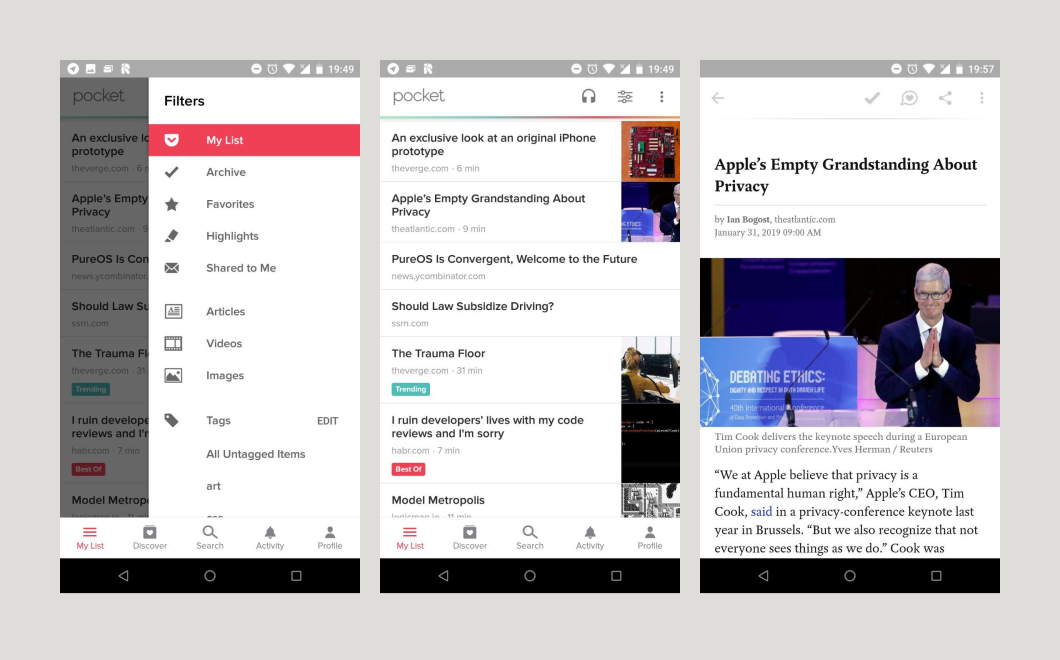
Pocket, on Android, has way too many features – and a pretty complicated interface. It has many different categories, social features, a discover section, text-to-speech, and much more; most of these features are rarely used and make the app feel quite cluttered. Pocket is also not very good at helping you get through your list of saved pages; it mostly wants you to discover new things to save (and then not read them).
Clearly there are some lessons to be learned here.
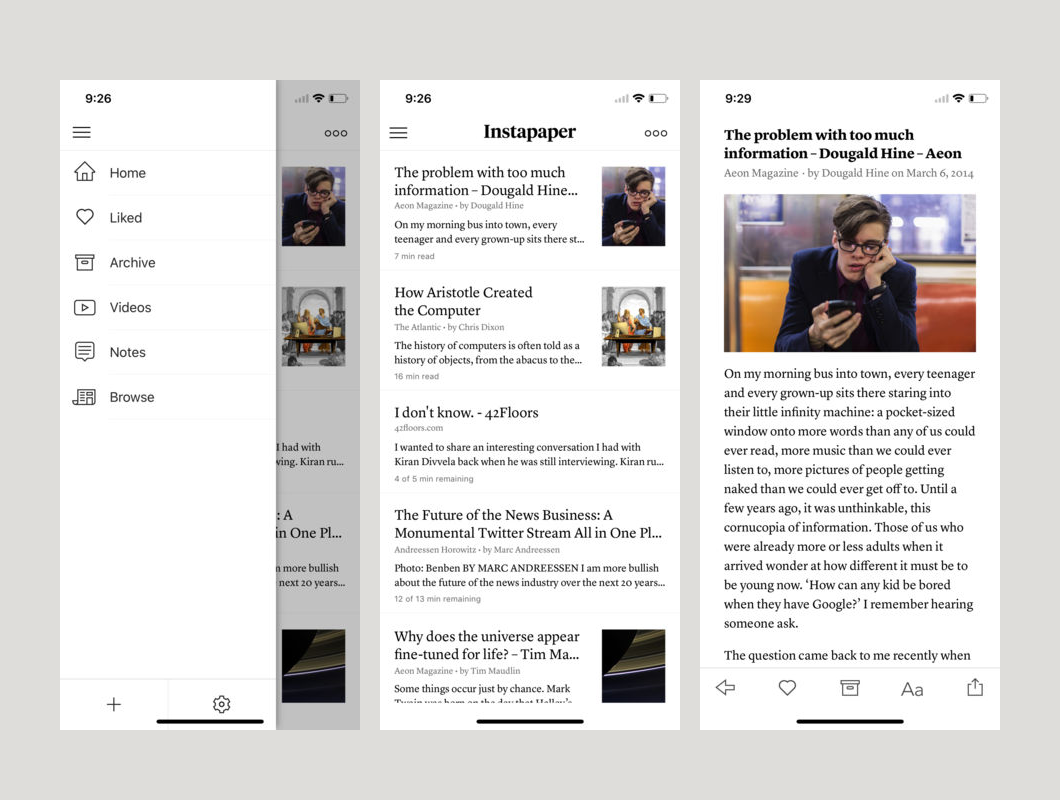
Instapaper is an app we’ve never really used, but judging from the screenshots, Instapaper’s UI feels a lot saner and way more focused than Pocket. The rich article previews in the list view and the typography are also quite nice.
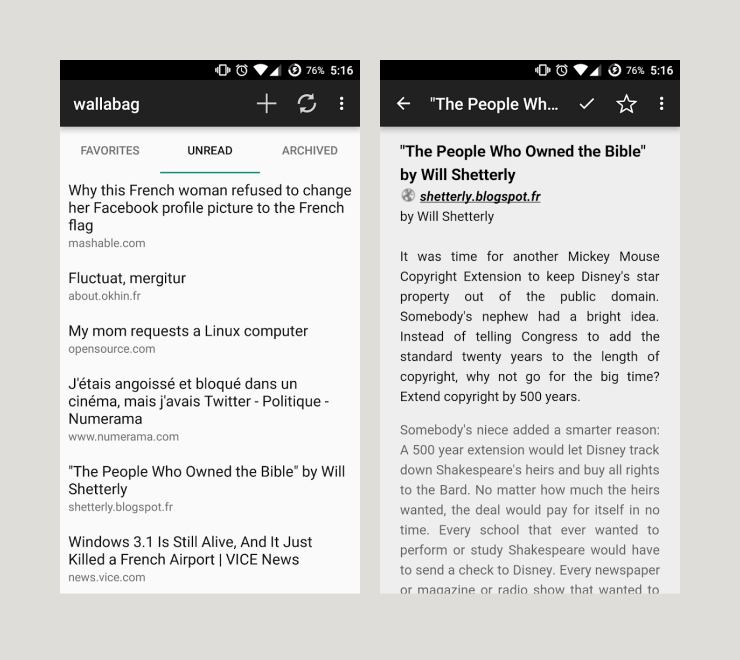
Wallabag is a self-hosted alternative to both Pocket and Instapaper. The corresponding Android client (also called Wallabag) is not very sophisticated UI-wise, but it is quite a good example of a very simple native client.
Structurally, these apps are all quite similar: they feature a main view with a list of articles, plus an article view that displays the articles in a clean, readable format. Depending on what service we are looking at, there are multiple lists for different types of articles – such as Archive, Highlights, Favorites, Notes, etc. To keep things simple, and because we’re targeting Wallabag first and foremost since it’s the only self-hosted service, we’re keeping three categories only: Unread, Archive, and Favorites. This means we need to design four main screens for our application: the three article categories plus a reader view to display the content.
We know our needs, and we may close this part of the design process. You should have, by now, a very clear idea of what you need in order to design an application for the Librem 5, and of the GNOME design philosophy guidelines. Later on, we’ll be guiding you through the rest of the application design process – stay tuned for the second part of this tutorial, to be published soon!
Discover the Librem 5
Purism believes building the Librem 5 is just one step on the road to launching a digital rights movement, where we—the people—stand up for our digital rights, where we place the control of your data and your family’s data back where it belongs: in your own hands.
Recent Posts
Related Content
- Librem 5 Ranked #1 Most Secure Mobile Phones to Buy in 2024
- $99/mo Librem 5 + Librem AweSIM
- Missing from Privacy Legislation- The Abolishment of Surveillance Capitalism (Predatory & Harmful Surveillance Business Practices)!
- Easy App Development: Text Forwarding
- Retain Your Control and Customize Everything with Modular Software