Ethical aesthetics – Librem 5 design report #7
François Téchené
Latest posts by François Téchené (see all)
- Black Friday - November 29, 2024
- Replacing the Screen of Your Librem 5 - January 25, 2024
- Working with the Librem 14 - November 22, 2023
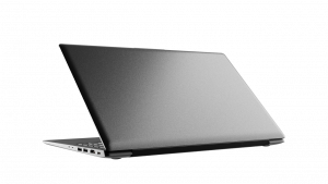
 You may have noticed that there is no obvious visual branding on the Librem laptops. While this was at first a technical limitation on the very first Librem model (back in 2015), the subtle and minimalistic branding that began on newer models in 2016 was a conscious design decision.
Now, we’re hoping to refine the physical branding further.
One reason for a minimalist design is aesthetic. Just like on a piece of hand-made jewelry, we wish the branding to be made in the form of an inconspicuous marking that doesn’t interfere with the natural beauty of the overall shape.
Another reason is ethical. While one should easily be able to identify a computer model when closely inspecting it, people using a Librem device should be prevented from, unintentionally, exposing the brand of their hardware, which may be seen as arrogant in some situations. But, above all, the Librem customer should not be used as a passive promoting medium. We think that this is an essential part of an ethical design.
This is described within our internal industrial design policies in term of visual identity, so I think important to emphasize those points.
Branding on the Librem laptops
 Therefore, on the current Librem line, branding is only visible on the keyboard (with the “Super” key displaying the Purism logo) and on the bottom cover, displaying the brand and model name, along with certification symbols, underneath the computer.
That said, while not being visible during normal use (open on a table), the bottom branding of the Librem may be considered a bit flashy when carrying the laptop around, so we are considering making it even more discreet in the future.
Branding on the Librem 5
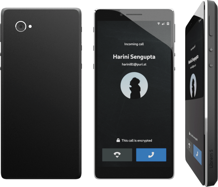
The Librem 5 is not in production yet but the public mock-ups have been escaping that rule so far. While I think that it was important for everyone to easily identify the device mock-ups during the campaign, the final model should not display any branding on the back cover of the handset. Instead we are discussing the possibility of having the brand and model number carved on the side of the device.

Recent Posts
Related Content
- Google Mishandling School Children’s Data
- Ethics over Exploits – Use PureOS over Android/iOS
- Hidden Operating Systems in Chips vs. Secure, Auditable OSes: A Cybersecurity Comparison
- Apple Moves iPhone Production to India—Purism Has Been Leading the Way for Years
- What Is PureOS? A Beginner’s Guide for iOS, Android, and Windows Users


