2019 Year in Review: Design
François Téchené
Latest posts by François Téchené (see all)
- Black Friday - November 29, 2024
- Replacing the Screen of Your Librem 5 - January 25, 2024
- Working with the Librem 14 - November 22, 2023
We are only a small design team at Purism but we cover a wide area of design related work. Here is a review of what happened in design in 2019.
Creative design
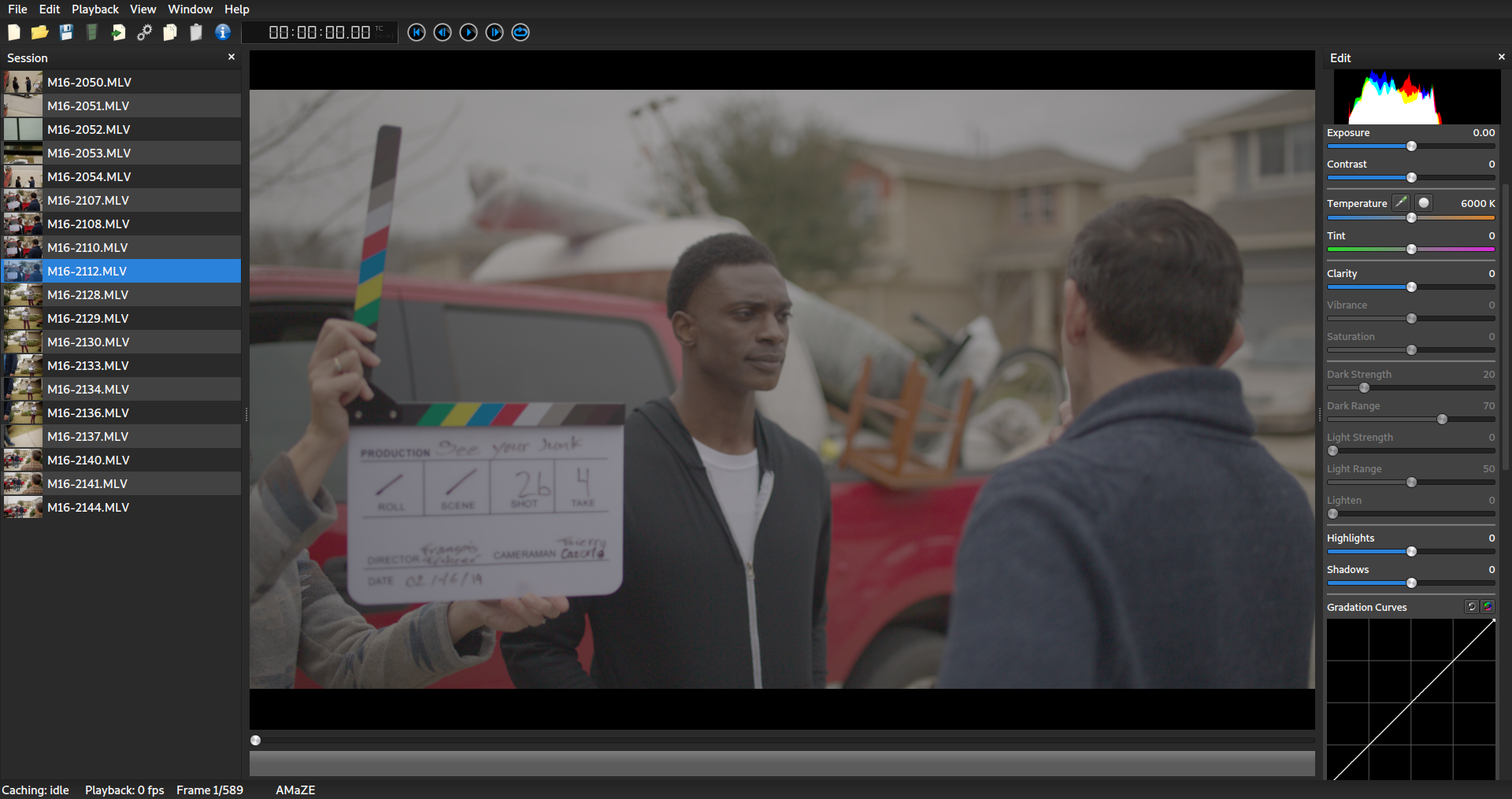
Early in 2019 we successfully produced a professional video campaign for the Librem One launch using completely free software. It was the first time I pushed a fully free software based workflow in such a professional way, especially on the audio side. We only had a small budget but with a very talented team we managed to get a result that I am extremely proud of. We shared our process in a behind the scenes video and blog post and shared our small software contribution with the community.

Website design
Websites are a constantly evolving showcase based on marketing’s feedback. We cleaned up the Purism shop and improved our products images. We also created multiple design iterations for Librem One and completed the PureOS Store website (not yet public).
Branding design
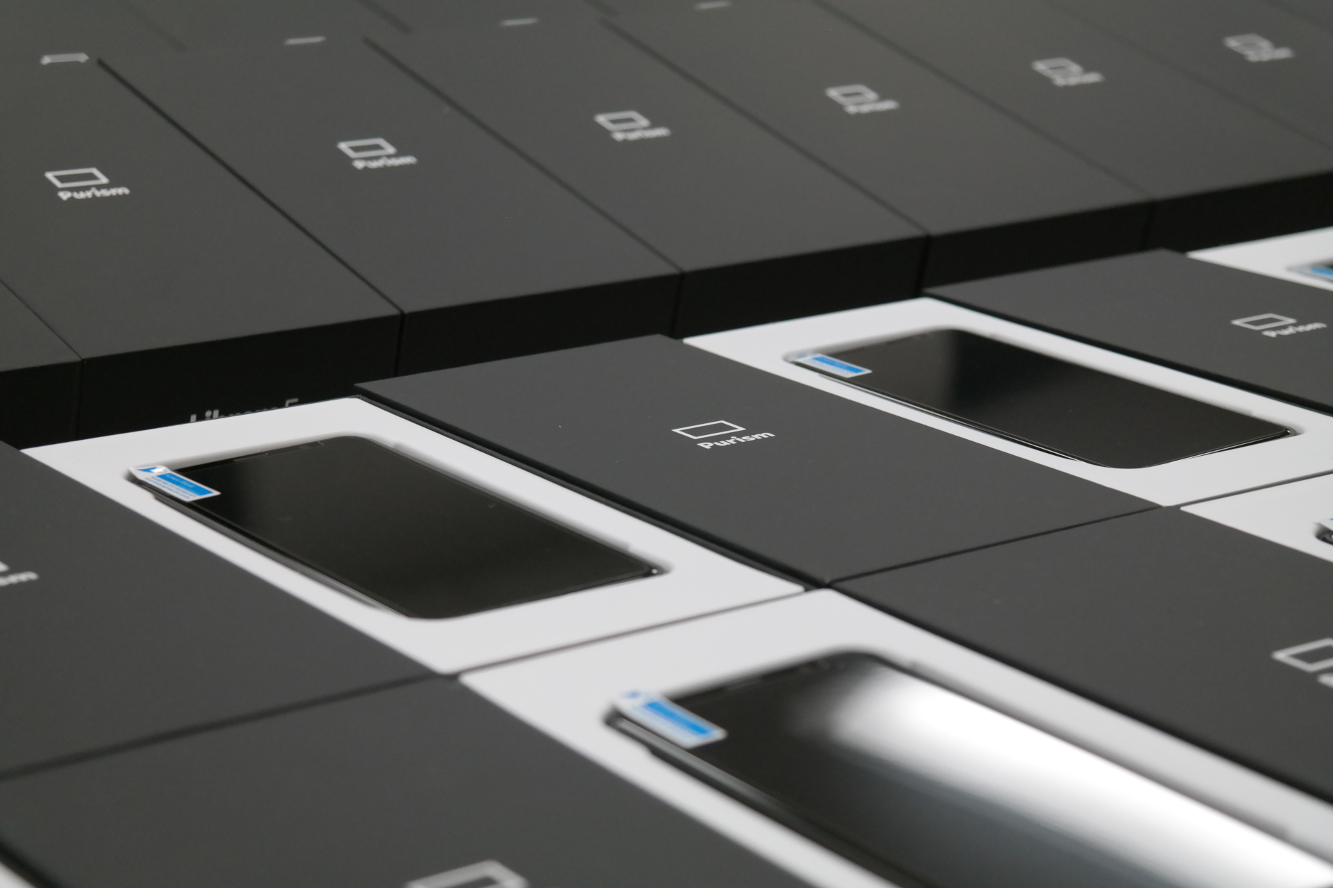
A lot of our design energy was focused on the Librem 5 in 2019. We have been working a lot on the unboxing experience. The original idea was to have clean and humble branding and thanks to the talent of Nicole and Petra we achieved that. We managed to get a unique device with a nice look and feel and a beautiful box that I believe our customers will appreciate as much as we do.

Software experience design
On the software side, most of the effort was also targeting the Librem 5 while focusing on designing a beautiful integrated experience where the hardware, software and the services become one.
Our UI/UX design team now has two talented GNOME designers: Tobias, who was later joined by Sam. They actually represent half of the GNOME design team. Together they have been doing an amazing job in designing a coherent way of using GNOME on both the desktop and mobile platforms.
I wanted to let Tobias, being the lead UI/UX designer, talk about 2019’s achievements:
The thing I’m probably most proud of is how well we’ve managed to work with upstream. There are very few other examples of companies doing product successfully upstream in a way that benefits both them and the wider community.
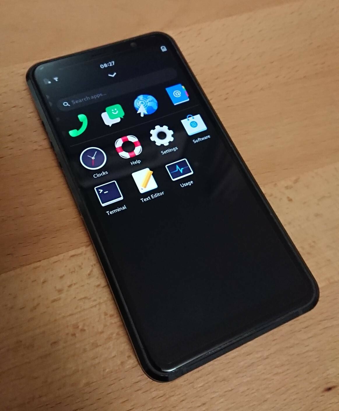
I’m also pretty excited about the design of our phone shell, because we’ve avoided just putting a simplistic app grid front and center and making multitasking a weird thing off to the side which nobody uses. Both Android and iOS made this mistake early on, and their OS structure is still more complicated than it needs to be because of it. Our shell has a long way to go of course, but we have the advantage of starting with the right structure from the get go.

On the app side, I think it’s awesome how natural it feels for apps following the GNOME HIG to be ported to mobile using the new design patterns and libhandy widgets. Other platforms are trying similar things right now (e.g. Catalyst on macOS), but in most of those cases the resulting apps feel native to mobile, but not really to the desktop. Given our resources and the limitations of GTK3 I’m very happy about how smoothly things have gone so far in this area.

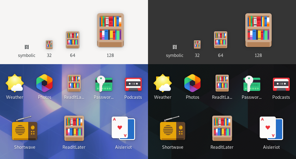
The new GNOME app icons we did last year are also something I’m proud of, not only because it was a very successful example of upstream-first product work, but also because it improves the developer/designer experience by orders of magnitude.
Recent Posts
Related Content
- PureOS Crimson Development Report: November 2025
- PureOS Crimson Development Report: October 2025
- Consent On Everything?
- 60 Minutes Uncovers Hacks on America’s Infrastructure
- Google Mishandling School Children’s Data


