Design 2022 in Retrospect
Purism
Latest posts by Purism (see all)
- A Quarter Century After Cyberselfish, Big Tech Proves Borsook Right - December 20, 2025
- PureOS Crimson Development Report: November 2025 - December 15, 2025
- Purism Liberty Phone Exists vs. Delayed T1 Phone - December 10, 2025
As you probably know, software work at Purism follows upstream-first principles. This means we contribute to projects directly to make them better for everyone rather than just applying custom changes for ourselves downstream. From a user interface and design perspective this mostly means working on GNOME and various adjacent projects, including core and third party apps, libraries, developer tools, and more.
Because of this upstream-first approach, the Purism design team (Sam Hewitt and myself) is deeply involved in the work of the upstream GNOME design team, where we collaborate with people across the community and from other companies (such as Red Hat or Endless) to push the project forward. This means much of our work is perhaps less visible than downstream things explicitly branded as Purism projects, but it’s all the more impactful because it benefits the entire ecosystem — while, at the same time, paving the way for Purism devices like the Librem 5 to succeed medium-term.
Here’s a retrospective with some highlights from our work throughout the past year.
GTK4 and Libadwaita
If there’s an overall theme for 2022 it’d be GTK4 porting (or more specifically Libadwaita, our platform library for making adaptive apps). GTK4 is the next generation of the platform, and getting as many apps as possible updated was a big focus for the entire GNOME project throughout the year. This naturally has meant lots of opportunities to improve the design along the way, since some apps were updating their UI for the first time in years and were finally updating to the latest design patterns. While this transition is not complete yet, a critical mass of apps have been ported at this point.
GNOME 44 (to be released in March 2023) will come with some important new GTK4 ports including GNOME Web, in no small part thanks to Alex Mikhaylenko’s work on it this cycle. This will bring not only much-improved performance and a streamlined user interface, but also enables other GTK4 apps using WebkitGTK to port since a lot of work went into it for the Web port.
While most of the work on Libadwaita 1.0, the new stylesheet, and various new widgets happened in 2021 and the focus this year was mostly on porting apps to them, Libadwaita has still received quite a few useful new widgets:
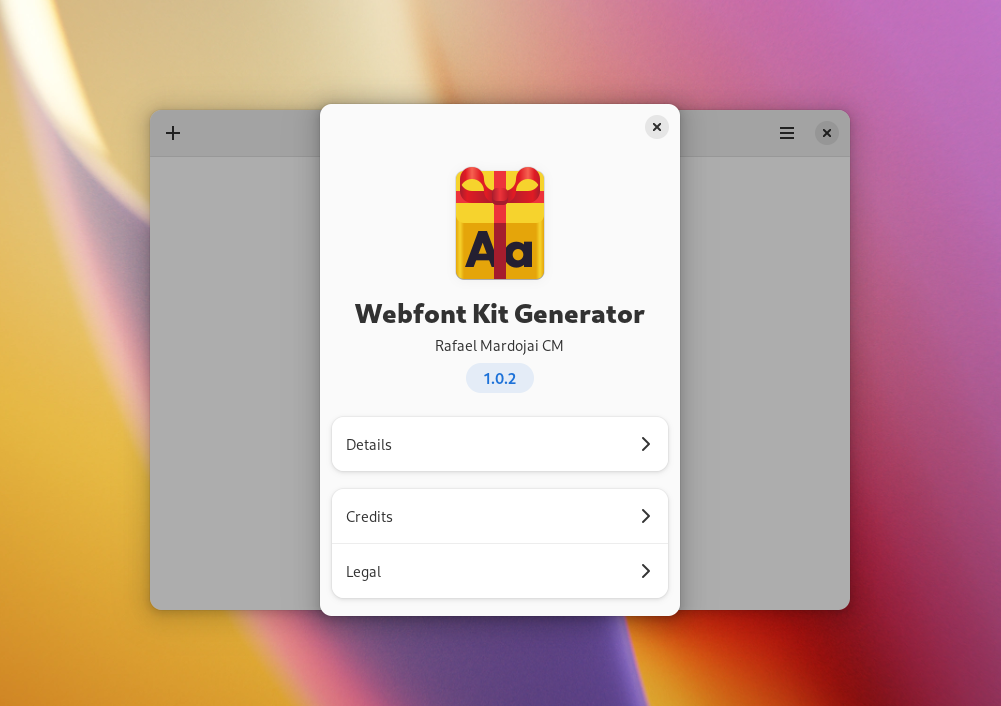
About Window: A new About dialog widget that looks nicer, allows apps to include more information, and is of course adaptive.
Entry Row: A very fancy text entry widget that can be easily integrated in a listbox layout. This took a lot of iterations to get right, but thanks to Maximiliano’s and Alex’s attention to detail it’s now one of the nicest widgets we have.
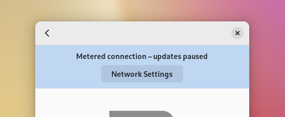
Banner (coming in GNOME 44): A new streamlined, adaptive replacement for the old GTK Infobar widget.

Core Apps
Over the course of various GTK4 ports lots of design work went into the core app set in the form of reviews and minor improvements that happened alongside the port.
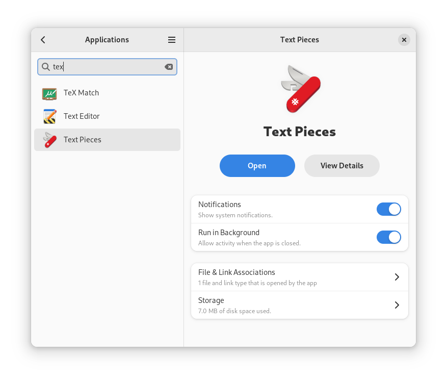
Settings saw a lot of overall polish, consistency, and adaptiveness improvements, in large part because it uses the new, standardized Libadwaita widgets in more places.
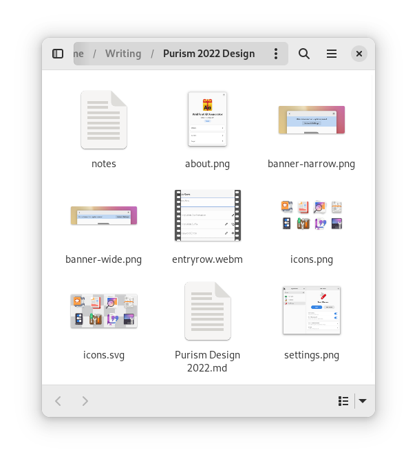
Files 43 brought massive visual improvements, a redesigned Properties dialog, and is pretty close to being fully adaptive now.
Console (which was already the default terminal on the Librem 5) became the new default GNOME terminal app, and also got a lot of polish as part of the GTK4 port.
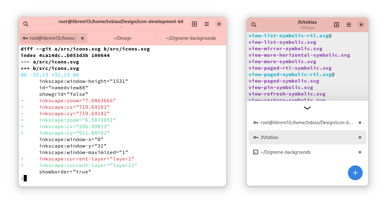 Other apps that got a lot nicer over the past year include Software, Calendar, Text Editor, and Contacts.
Mobile Shell
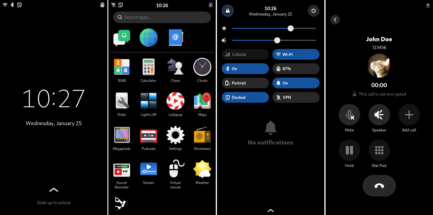
Phosh continues to mature and the past year saw many user interface refinements and updates. Nearly all control elements of the shell received a visual tune-up as well as under-the-hood improvements for non-touch navigation and focus to boost phosh’s usability. Also incoming to the quick settings view is a new layout for settings toggles as well as an improved notification drawer.
GNOME Shell
GNOME Shell 42 featured a number of cool things Sam and I were involved in. My personal favorite is the new screenshot UI (implemented by Ivan Molodetskikh), which brings a first-class integrated screenshot and screencasting UI to GNOME Shell for the first time. Sam also reworked the GNOME Shell stylesheet in 42, bringing it up to date with the new style in Libadwaita.
GNOME Shell 43 brought the new Quick Settings, which was a multi-year effort from the whole design team and went through many iterations before we settled on what was finally implemented (e.g. see this issue from 2019).
App Icons
Thanks to a long-term investment in the new icon style and associated tooling a few years back, we have a pretty awesome workflow for making app icons nowadays. This makes it possible for our relatively small design team to keep up with icon requests from core/downstream apps relatively easily, and sometimes even help out third party developers with better icons. Here are some of the nicer ones we did in 2022:
![]()
And so much more!
A lot of the work the design team does is longer-term in nature, and doesn’t ship in one or two cycles.
The gradual transition to adaptive apps is a great example of this. Getting to where we are today has required lots of conceptual and planning work upfront to come up with new widgets and designs, but also coordination, review, and QA during implementation across dozens of modules over several years.
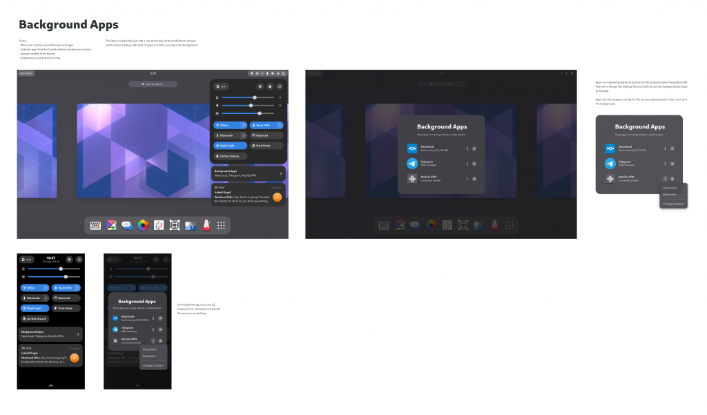
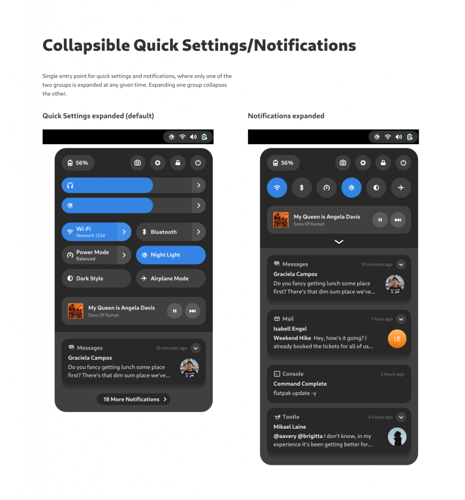
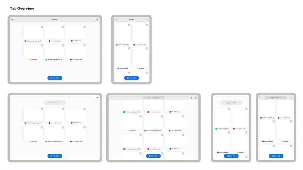
Some examples of more speculative/long-term work we’ve been involved with over the past year (these are just mockups at this stage, and may never ship in this form):
Recent Posts
Related Content
- PureOS Crimson Development Report: November 2025
- PureOS Crimson Development Report: October 2025
- Landfall: A Case Study in Commercial Spyware
- Consent On Everything?
- 60 Minutes Uncovers Hacks on America’s Infrastructure


